Adoption Data Analysis and Visualization
Growing up as an adoptee in a mixed-race household, I became fascinated by the forces that shape families like mine — policy, geography, culture, chance. How many people share a similar experience? What systems brought them together? This page is an ongoing collection of analyses exploring those questions through the lens of adoption data.
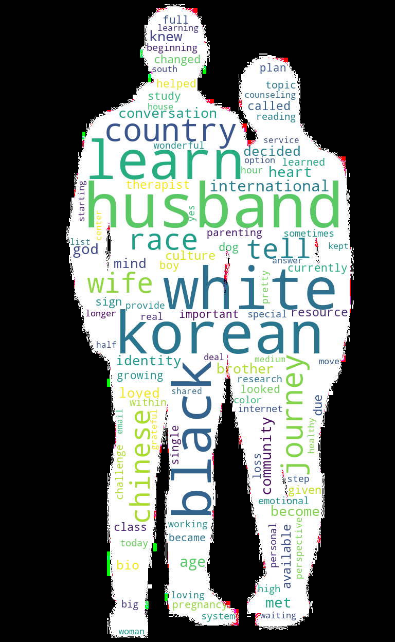
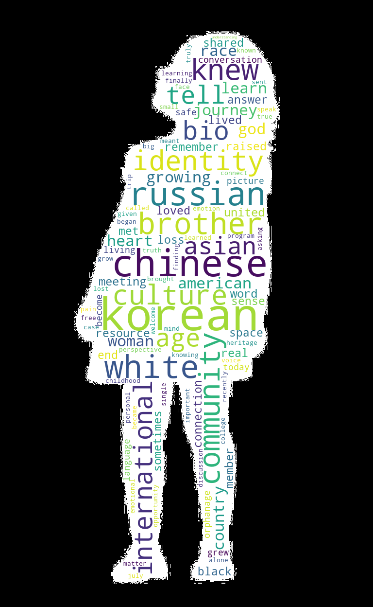
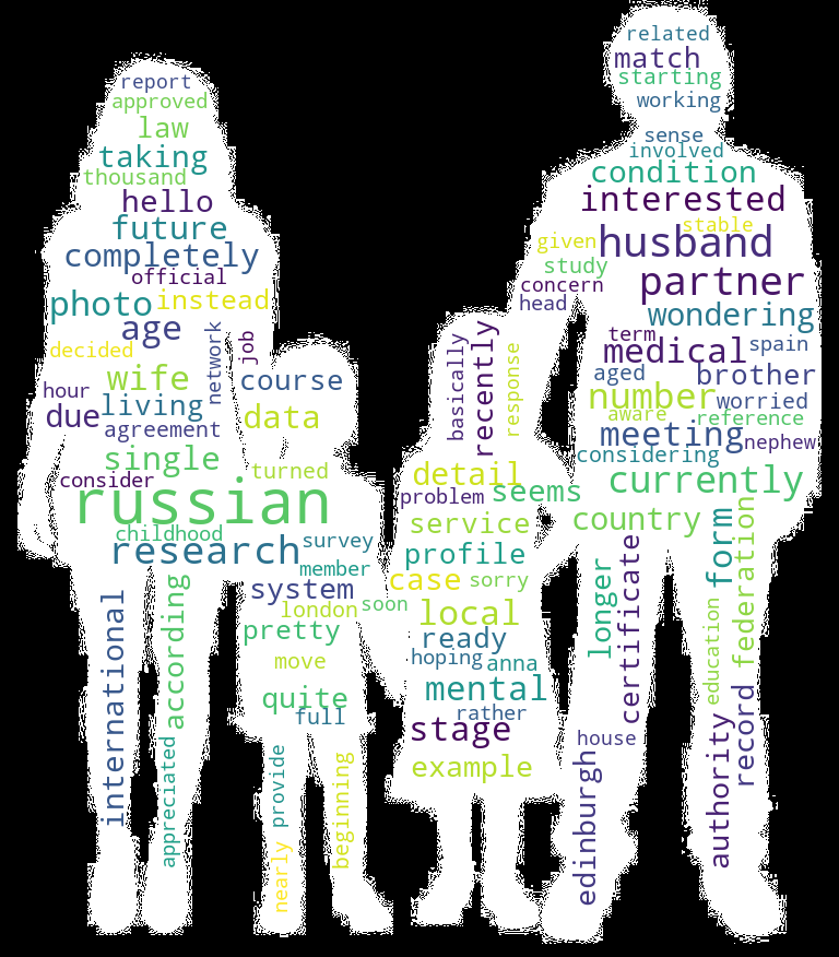
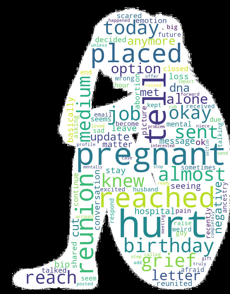
The following sections are word cloud analyses of the words used by adoptees, adoptive parents, and birth parents in online forums such as reddit and adoption blogs. I mined these blogs, performed lemmatization and stopword removal, normalized the same frequency words across groups, and then created word clouds for each group.
The following sections are comparisons of adoption rates vs. GDP per capita for countries of origin and receiving countries. This is a simple analysis that shows the relationship between economic development and adoption rates. Double click on a country in the legend to highlight data for that country.
The following section is a network map of the international adoption network. This is a simple analysis that shows the relationship between countries and the number of adoptions between them. Double click on a country in the legend to see the number of adoptions from that country and where the adoptees were placed. The vast majority of adoptees come from Korea or China and are placed in the United States.